Drawing Six of the Project - Focusing on experimenting with two point perspective- trying new paper
- gemfirth123
- Mar 13, 2021
- 8 min read
Drawing Six of the Project - Focusing on experimenting with two point perspective, and trying new paper.
As I have been focusing on the two point perspective aspect of my workshop, I have decided to look into developing my own ability of it within my practice. As mentioned previously, this is an aspect of my practice that I do use frequently and find it to be the most effective type of perspective for the type of buildings I use within my work, producing different outcomes of two point perspective is something I want to focus on. Often, I do not use a clear example of this type of perspective because the building has objects obstructing it, or I photograph the building from a slightly more interesting angle or distance, making it less clear for the viewer to interpret. I like to produce work that is quite natural looking in terms of its angle, and allow the level of detail I incorporate into the piece to interpret the building in its entirety. With this latest drawing, I wanted to experiment with two point perspective in its simplest form in the manner in which I use it, while experimenting with a different type of paper. Experimenting with two aspects of my practice, the use of a drawing fundamental and a different surface, allows me to continue to pursue multiple
lines of investigation within my work at the same time. This is useful for my project because I can make multiple small changes in how I approach aspects of my work without it being unmanageable or unattainable to produce a positive outcome. It is my intention to go through the process of my latest drawing, noting down what I have noticed, learnt and what I intend to use the development of the drawing for, including the final outcome.
Selecting a reference that was a good example of two point perspective was challenging as I typically photograph my subject matter in a manner that aims to make the subject look as natural as possible, which is often on an angle. I do not necessarily focus on achieving the best example of perspective. With this in mind, I have selected a reference that has two sides of the building clearly visible, which indicates the need for two point perspective as opposed to one point.

Although it is not the most common example of two point perspective, the fact that the viewer can clearly see who sides of the structure shows the use of the drawing fundamental well. I would consider the most common example of two point perspective to be where two streets meet, whereby you can see down both streets, one of the left and right. I think the reference I have chosen is a good example of the type of perspective I am focusing on, but still has my subject matter are the forefront of the the piece, which keeps it within my project.
As well as this, I have decided to work on a different type of paper for this piece to continue the

experimentation with different aspects of my process. I have chosen a paper that is handmade in India, which has a slight cream undertone to it due to it being made from a mixture of other types of paper. Typically, I would use a paper that is bright white, watercolour paper with a prominent texture to it. This is significant because the contrast between the ink and the paper is higher the brighter the white is, creating a clear, bold and monochromatic outcome. As well as this, the texture of the paper affects the way the application of the pen occurs, and has an impact on the level of detail that is represented on the paper. Usually, the paper’s texture allowed me to emphasise the wood grain to make it an integral part of the drawing. However, opting for a cream paper will change the undertone of the drawing, which is something I have previously not experimented with. Experimenting with different types of paper is something I want to experiment with further as I want to alter the colour of the ink in future pieces, however working on handmade paper will change the drawing in terms of its contrast, application and scale. The grain of this paper is also more inconsistent, with areas being rougher than others on the same sheet. This does have an impact on how I apply the pen, making it slightly more challenging to determine how the pen will look across the whole piece. One thing I did
notice with this paper is the the ink shifted slightly greyer than in previous pieces due to the grain, porous nature of the paper and the undertone of the paper itself. Even in the early stages of the piece, it has shown me that the paper that I use is an important factor in how the drawing is produced and translated. One positive from this area of experimentation is the drawing looked softer in many aspects, due to the lack of very dark areas. I think this is because the ink translated slightly greyer than in previous pieces, which is something I liked. It allowed the details to be more prominent, rather than the tonal range. Also, achieving a softer look is something I have wanted to pursue in my work to develop how I apply the fine liner in different situations. Using a different type of paper has really helped my understanding in terms of achieving this.
As I progressed through the drawing, I began building the texture of the wood through focusing on the shapes and lines I could see within my reference. This is something I typically aim to do in all of my drawings, with the way I focus on capturing the grain of the wood being the main way of generating realism in my work. I like the process I use when drawing in this manner because I do not have to focus on tonal range, as the chosen medium struggles in this area. Instead, I am

drawing what I can see and focusing on the textural elements of the structure and allowing that to show light and dark, rather than building a tonal range that is hard to achieve accurately in pen. When I got to the roof area of the drawing, I relied on the cream tone of the paper to help me depict the fabric on the top of the structure. I wanted this area to look soft, which required me to apply less pen in this area. Focusing on less pen on this area, and placing the pen to develop the folds in the fabric allowed me to create movement in this area and therefore keep it realistic. I opted for less pen for greater impact in this area. Here, I have included a close-up of the drawing in this area. It clearly shows that I have formed folds in the fabric, where I have emphasised the shading. I like this effect because it has reminded me that less is more in certain situations, and the drawing has benefited from a lighter approach to show some differentiation between the dense wood and the fabric. Learning how to

depict different materials with these structures has also become a big part of my drawing development because I cannot rely on tonal range in a similar way to pencil drawing. Therefore, identifying the texture of a material and finding the best way to depict it with a scratchy medium is becoming a priority in my project that I am continuously learning from. One area I really need to improve in a similar manner is glass, and finding the best way to show it in its most realistic form. This is something I want to review through the next selection of drawings I do to see what approach is the best for a transparent, smooth material.
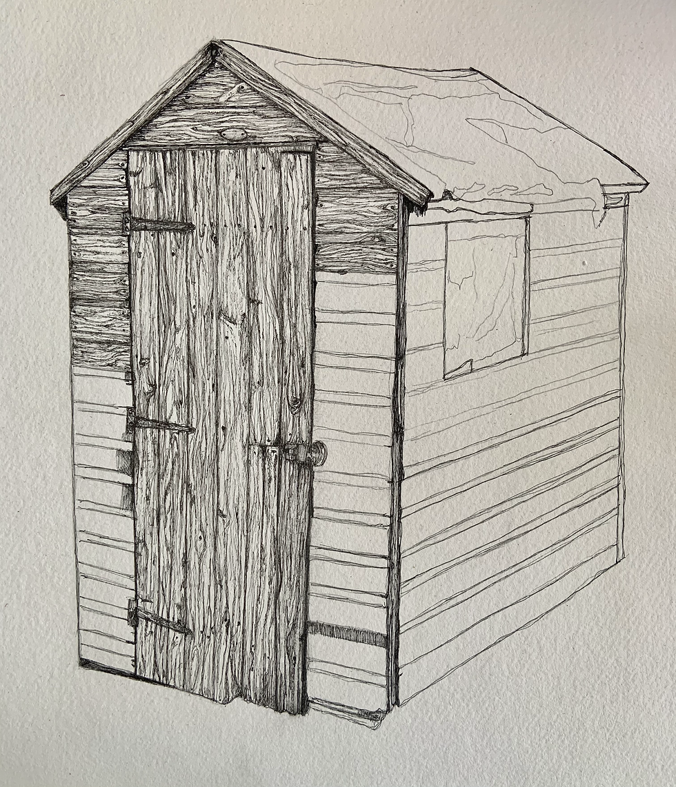
FINAL DRAWING

This is the final outcome of the sixth drawing of the project. I am really pleased with the outcome of this simple, yet effective example of two point perspective because it has shown me that my process can be simplified down while still being effective and within my realm of trying to achieve a high level of realism. Although this drawing is smaller than my prior pieces, the fact that it still has the same level of detail is a positive sign that my process can be translated to a smaller scale very effectively. Although I prefer to work at A2 and above, due to my want to work on a different quality of paper, it affected the size I was able to work at, which can be a limiting aspect of this piece. The outcome of the drawing is still of a similar quality, however I would still like to work at a larger scale in upcoming pieces because I feel that the larger pieces are more imposing and therefore demand more attention from the viewer. Looking at this piece in comparison to my prior drawings, the only significant different is the amount of negative space around the shed itself, due to the paper being smaller. The negative space has become an important part of my work because it gives the illusion that the shed is floating, and therefore could be in a location at any time. The removing of the landscape gives the feeling of freedom for the viewer to form their own connections to the structure, rather than providing them with my experience of the place the shed was actually situated in. It gives the viewer the ability to freely interpret what they are seeing. I think the lesser the negative space the narrower the drawing, and I believe the experience of viewing it changes, which I do not think is negative necessarily, but it portrays a different feeling.
Working with a different texture and tone of paper has also given me some interesting outcomes that I would like to pursue further within my project. The use of a cream paper that was inconsistent in terms of its texture changed the application and the consistency of the mark making techniques I used, which ultimately added to the accuracy of the drawing. I feel it gave the piece more character and allowed me to rely on the base colour the paper more to depict other textures in the pice, like the cloth on the roof. This is something I certainly miss with using white paper, you loose that reliance on the base colour because you are looking for a higher contrast outcome. As the cream paper provided less of a contrast, the ink became a grey tone, which I think again added to the positive outcome because it was so different to my other drawings. I think this has shown me that I ned to be using a range of inks, colours and paper to see where I can experiment with this subject matter next. In this sense, the piece has been extremely insightful and beneficial to the project’s next steps.
Focusing on the use of two point perspective was one of the main reasons for embarking on this drawing, and I believe this aspect was very successful. I think the simplicity of the angle of the shed shows that my drawings do not have to be complicated to be effective in this area. It has allowed the depiction of the details and texture to be the priority, which if feel is the more important part of how I work. Although having accurate perspective is important in terms of drawing a three dimensional object on a two dimensional plane, having accurate details and a certain level of realism in my work forms the main emphasis of how I work. I think this drawing has shown me that I need to be creating pieces form a variety of angles, simple and more experimental to give my project balance and the room to grow through experimentation in this area. I believe that this area of experimentation has shown me that I need to produce a variety of drawings to make a body of work that is wide ranging.
Overall, I am very pleased with the outcome of this drawing, and see the use of perspective and the different toned paper as a positive that I can build upon in future drawings.

Comments